


Color Theory
- Chris Ma

- Jul 13, 2020
- 9 min read
Updated: Mar 24, 2021
Color theory can seem extremely daunting, but it's worthwhile to learn in order to portray a certain mood or idea.
While I am just a beginner, and am in no way a master at color theory, I have picked up some tips from other artists and through experimentation. If you disagree with anything I say, please let me know! I would love to learn more and be able to pass on information.
Also, these "rules" are only suggestions; it's great if another method works for you or you've learned how to manipulate these "rules" to fit your needs.
Here are some stuff that I have found helped me!
1. Primary Colors
I often recommend to artists on a budget--who want to upgrade their art supplies--to only get primary colors to start with to (A) improve their color mixing, and (B) save some money.
However, color mixing with the "primaries" red, blue, and yellow can get frustrating as a lot of artists find themselves struggling to mix exceptionally vibrant cyans or brillantly bright royal purples without dulling the paints with white.
This is because red, blue, and yellow are not the ideal primary colors for painting.

Here's wonderful video I've found that breaks down the history of primary colors, as well as establishing a few main subcategories:
To greatly simplify, for almost all mediums of 2D art (subtractive colors), cyan, magenta, and yellow are excellent primary colors to work off of.
As you can see from this rudimentary chart I created, you can mix richer blues as well as vibrant reds from the set chart. Therefore, royal blues and red are not primary colors.
Why blue and red don't always work
I'll explain later in this post about warm and cool variants of colors, but as a quick summary, every color (blue, red, yellow, purple, green, etc.) has a warm and cool variant which depends on it's undertones/what it's mixed with.
As the above color chart shows, blue and red are secondary colors, a.k.a. a cool and warm variant (respectively). This matters because when you mix a cool blue with a warm red, you'll get a duller purple than if you mix cyan and magenta.
You can always dull colors by mixing their complimentary color, but it's hard to liven up dull colors (I'll go into this more in the saturation section). This means some extremely vibrant colors will be out of reach.
To compensate, a lot of limited primary palettes have a warm and cool version of RBY, and the issue is chalked up to "pigment impurities". However, this is often unnecessary when a simple three-color-CMY could replace this six-color-RBY.
Why do we use/teach RBY so often then?
Simply put, tradition.
The video linked above delves more into this (along with the history as well as why RBY shouldn't be ignored entirely), but CMY is, in my experience, better for painters.
More on additive/subtractive
If you are only interested in color theory from a painting perspective, ignore this. This is completely irrelevant.
Basically, subtractive colors (subtracting light) apply more to pigments (like paints). Their primary colors are CMY. When added all together, black is created.
Additive colors (adding light) apply more to light. Their primary colors are RGB. These colors are also the three color cones we have in our eyes. When added all together, white is created.
Something to notice is that the secondary colors of each are the primary colors of the other.
Paint, and most physical objects, shows colors it does not absorb (for example, a pure green ball absorbs all light except for green, which then bounces into your eye). Whereas colored light is viewed as the color the lightwave is (pink light is pink light, no absorbtion here). That's why additive and subtractive colors work backwards from each other, one from black-to-white and the other white-to-black.
More information in the video linked above.
Color mixing experimentation with these primaries might help some artists with being able to experiment and mix (essentially) every color they see.
2. Warm and Cool Variants
When we learn about warm and cool colors in kindergarten, we are often told that blue is a cool color and yellow is a warm color, and that's the extent of it.
However, warm and cool are often relative. Within these blues and yellows, there are warm and cool variants of each. Because it's all relative, there is debate between which blues are warm/cool.
A good rule of thumb is to look on a color chart.
Using this chart again, you can see which direction you must go from the "pure" primaries to create warm and cool variants of each color.
However, there is great debate about the blue section of this wheel. Ultramarine--a blue with a red bias--can be debated as cool--and Pthalo Blue--a blue with a green bias--can be debated as warm. Some say that it's just the distance away from blue in general that dictates if a blue is warm or not, meaning that both ultramarine and pthalo blue are warm.
More on this debate in this link:
I personally see blues with yellow bias as warm and blues with red bias as cool, but the larger consensus is that blues with red bias is warm and blues with yellow bias is cool, so that is the information I will relay.
Why does this matter?
This is essential to know when it comes to creating a palette and color mixing.
An issue I had when I was starting out art was that I was mixing yellow and red colored pencils to try and get a beautiful orange, but I instead got a dulled brown-ish orange. When I tried to add blue to turn it into a realistic skin tone color, I instead got an murky green/brown/purple/swamp color. While this color could be utilized in skin shadows for color variation/depth, it wasn't what I wanted as a midtone. I kept getting frustrated, and I didn't know how to fix it.
The issue was I didn't understand warm/cool variations.
I was trying to mix a cool yellow with a warm red and expecting a vibrant orange.
Mixing cool variants with a warm variants will dull out the mixed color.
If you want vibrant colors, mix warm-warm or cool-cool. If you want a duller color, mix warm-cool. It's a simple trick that I simply wasn't taught, and it changed my color-mixing skills once I did.
When creating a palette, as I'll go further into in the saturation section, this is also great to keep in mind. If you have majority warm-variant colors, any cool-variants will really pop, but you don't want to over-do it.
Keeping to all warm or all cool will help with cohesion, but adding that warm/cool pop can bring emphasis and depth to your pieces.
3. Saturation
Saturation seems simple enough, but for me, this was the hardest part of color theory for me to master. It has a hidden depth.

I created this simple sketch to help explain the importance and impact of color saturation. I'll elaborate on some main points I touched on.
Before I start a piece, I normally decide on a key color. This isn't a real art term (I don't think), but it's effective for what i need it for. In the key-colored sketch above, I chose red to be my dominant color. This means every color in the piece (the greens and whites included) have a varying amount of red/yellow mixed into it. While I definitely exaggerated the extent of which you can do this, if you compare it to the bottom, it feels more cohesive and less harsh on the eyes.
How do I choose a key color?
It depends on what mood you want and what you want to bring emphasis to in your drawings. I gave some examples of how different key colors can affect mood in the above graphic. However, you can also change emphasis. The green variant brings emphasis to the grass, because the grass is the most "pure" color in the image. The red variant brings emphasis to the sky, because the sunset is the most "pure" color in the image. It takes experimentation to full grasp how to play with it, but it's such a useful tool once you get it down.
You don't have to choose a key color though.
You can also just simply mute the other colors by mixing their compliment with it and desaturating it.
Here's an example of me doing both:

Doing this can actually make your drawings seem more vibrant in areas you want it to. I used pure red in the sun's face, and because the other colors aren't pure variations, the one purely saturated part of the drawing gets more attention. The bottom drawing doesn't have the same impact due to every color being overtly saturated. While you can use this overt saturation to your advantage, it's easier to learn saturation control and then break the rules where suitable rather than vice-versa.
The reason this is so effective to know for painting is the same reason some optical illusions work.
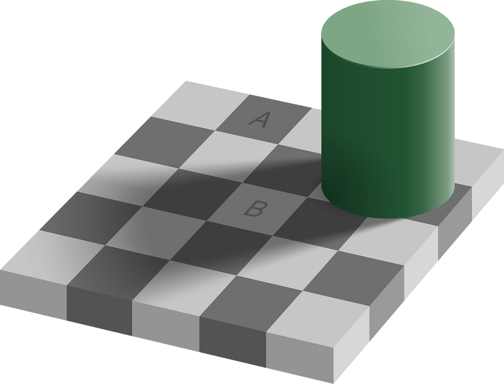
The "A" and "B" squares are relatively the same color/shade, but it doesn't look that way because of the shades relative to it. Using this same tool in terms of colors is a serious asset.
How do I desaturate/saturate colors?
It's simpler than you might think! There are several ways to do this, depending on what you're going for.
When you add black/white to a color, you tend to gray out the color.
When you add the complimentary color that matches it's warm/cool variation (warm green-warm red, cool yellow-cool purple, etc.), you tend to mix brown.
When you add the complimentary color that is the opposite of it's warm/cool variation (warm green-cool red, warm yellow-cool purple, et.c), you tend to make a vibrant black/gray.
In traditional art, you can desaturate colors through underpaintings/layers, mixing key colors, etc. I will link my youtube speedpaint below, which has an example of me using the opposite-color-underpainting trick demonstrated.
Applying this to a color palette
When creating a palette, you should keep all of this in mind. Pick a color to pop, and make it the most saturated. Every other color should be dulled out. Again, you can totally break this "rule" as it's more of a suggestion. Maybe in one piece you'd prefer every warm color to pop and every cool colored to be dulled, in another piece you'd prefer no colors to pop and everything be dulled, and in another piece you'd want everything to be saturated, etc. This is meant as a simple suggestion as to why your pieces may look a certain way. Bend and break these suggestions, and most of all experiment yourself to see what personally works for you.
4. Balance
After learning everything about colors, a crucial step is to learn how to apply this to composition to create balance.
Colors and shade go hand in hand in my eyes; for example, since yellow is a bright and paunchy color, it has similar properties as white.
Light takes up more space than dark.
Saturated takes up more space than desaturated.
Texture takes up more space than smooth.
There are many other balance rules/suggestions, but these are the main ones I'll touch on right now.
When altering balance in a colored piece, you not only have to focus on the usual rules of balance, but also take into account how to balance out colors.
Bright colors (like yellows and pastels) should usually take up less space than darker and moodier colors (like maroon and navy).
Complimentary colors should be balanced out with light/dark, saturated/desaturated, and limited space/big space.
Here are some rough examples:

The yellow and blue are both relatively the same level of brightness, and the blue has yellow mixed in and vice-versa, so it's not TOO overwhelming (still, both are very saturated which does make it overwhelming)

The blue is much darker than the yellow, and thus should taking up more space (they are both still too saturated, though).

In this, the yellow is saturated and bright, the red desaturated and dark. Colorwise, this is an excellent pairing, but the red takes up less space. However, this is a perfect example of learning to break the rules for effect; even though the red should theoretically take up more space than the yellow for balance, because colorwise it is matched, it feels okay to use. You can use this to make an area that is similar spacially to feel bigger and more impactful.
How do I balance complimentary colors?
I personally believe that "complimentary colors" can be a slightly misleading name for some.
Here's why:


Now every has their own preferences and tastes, and there is no "right" way/answer by any means, but I am going to assume that a majority of people would consider picture 2 to be more aesthetically pleasing/easy to look at.
Complimentary colors do compliment each other, but not when used in equal amounts.
Complimentary colors explain perfectly what I was talking in the saturation point. Having both complimentary colors be equally saturated and take up equal space (in terms of balance) is not usually visually appealing (again, plenty of exceptions). Complimentary colors don't usually look good together in the usual sense of complimenting a certain color/style/etc., but they compliment in terms of allowing another color to seriously pop.
Again, like I've stated throughout, this should be used as more of a guide as to why colors behave a certain way, and basic pointers as to how to control their (sometimes finky) outcomes. By no means is anything I said a hard and fast rule, and the most important thing is to practice and experiment using and breaking these rules on your own.
I hope this has helped you in some way!
Happy painting!
Christy Ma
@sketchedsong
Comments